Web Platforms / Buyer’s guide
Website Accessibility: What to Put in the Brief
Commission a website people can use. Define accessibility scope, complete journeys, evaluation evidence and ownership beyond an automated score.
The short answer
Specify a standards target, the pages and complete journeys it covers, and the evidence your supplier must deliver. Combine automated checks with knowledgeable manual evaluation and relevant user feedback; neither a score nor a successful demonstration proves the whole site is accessible. Include third-party steps, error states, content duties and a process for correcting findings. Confirm legal obligations separately for your actual markets.
Discuss your project ↗
Our take
A premium website should offer a clear route to the same useful outcome, not only a polished surface. Ask how someone will navigate, understand, correct a mistake and finish the task—and which evidence supports each answer.
In this article
01 / 08
A beautiful form can still leave someone at a dead end
Imagine a visitor requesting a quote. They reach the form, enter their details and press submit. A field turns red, but the message does not explain what needs changing, and someone navigating without a mouse cannot find the rejected field. The page looks finished. The task is not.
This is an illustrative situation, not an Axiom Forge client incident. It shows why ‘make the website accessible’ needs more detail in a brief. The buyer is commissioning a usable route through information and interaction—not merely a set of attractive screens.
Start by naming the outcomes people need: compare an offer, download a useful document, request a consultation, sign in or complete an order. Include the steps after the landing page, the ways they can fail and the feedback that tells someone what happened.
That does not require turning every project into a complex application. If a simpler interaction delivers the same outcome clearly, evaluate it before buying a custom widget. Accessibility belongs in the product choices from the start, not as a decorative setting added to an already approved design.
02 / 08
Name the target—and be precise about what it covers
A proposal should identify the standard version, conformance level, scope and evaluation approach. WCAG 2.2 level AA is a target worth discussing for a new business website. It is not a claim that every organisation worldwide has the same legal duty. Confirm applicable obligations with qualified advisers for your sector, markets and product.
The WCAG conformance requirements cover full pages and complete processes. If several pages make up a task, a claim at a given level cannot ignore a failing page in that process. Assessing a few selected components is useful work, but it is not the same claim.
Include languages, templates, content types, authenticated areas and relevant states. Name the browsers and assistive-technology combinations used for evaluation, and explain the basis and limits of that coverage. Testing every possible combination is not a credible purchasing promise.
State what is outside the engagement without disguising a blocked essential step. For example, excluding a third-party booking page may reduce the evaluation scope; it does not make a complete booking journey accessible by definition. Scope is a transparent boundary, not a way to describe unexamined work as passed.
03 / 08
Ask for evidence at the points where users can get stuck
The worksheet below is Axiom Forge’s buying framework, not a complete WCAG checklist. Use it to connect requirements to real content and tasks. A qualified evaluation still needs the full agreed standard and scope.
| Journey boundary | What to ask the supplier to demonstrate | Evidence to retain |
|---|---|---|
| Navigation and controls | Reach, identify and operate the relevant controls without relying on a mouse; enter and leave dialogs predictably. | Recorded steps, focus behaviour and unresolved barriers on the evaluated version. |
| Reading and understanding | Meaningful headings and labels, readable contrast and content that remains usable when enlarged. | Content examples, evaluation conditions and criterion-linked findings. |
| Form correction | Find the error, understand the correction and keep useful entered information. | Invalid-input and corrected-input journeys, not only a clean submission. |
| Changing content | Identify status changes and control motion or timing as required for the agreed experience. | Evaluated notifications, loading states and included time-dependent steps. |
| Complete task | Continue through login, third-party steps and confirmation where they form the process. | End-to-end results, dependency boundaries and known exclusions. |
| Future publication | Create usable headings, links, alternatives and documents in the actual editorial workflow. | Editor guidance, responsibilities and checks for new content. |
Do not accept an attractive screenshot as the evidence for these rows. The reviewed interface needs to be working, and the report needs to say which version and conditions were evaluated. A prototype can resolve design decisions; implementation may introduce different barriers.
04 / 08
Design the mistake, the correction and the confirmation together
In the quote-form scenario, three things must be distinguishable: something needs correction, there is a way to make that correction, and the request has actually reached the agreed successful state. A colour change alone cannot carry the whole explanation.
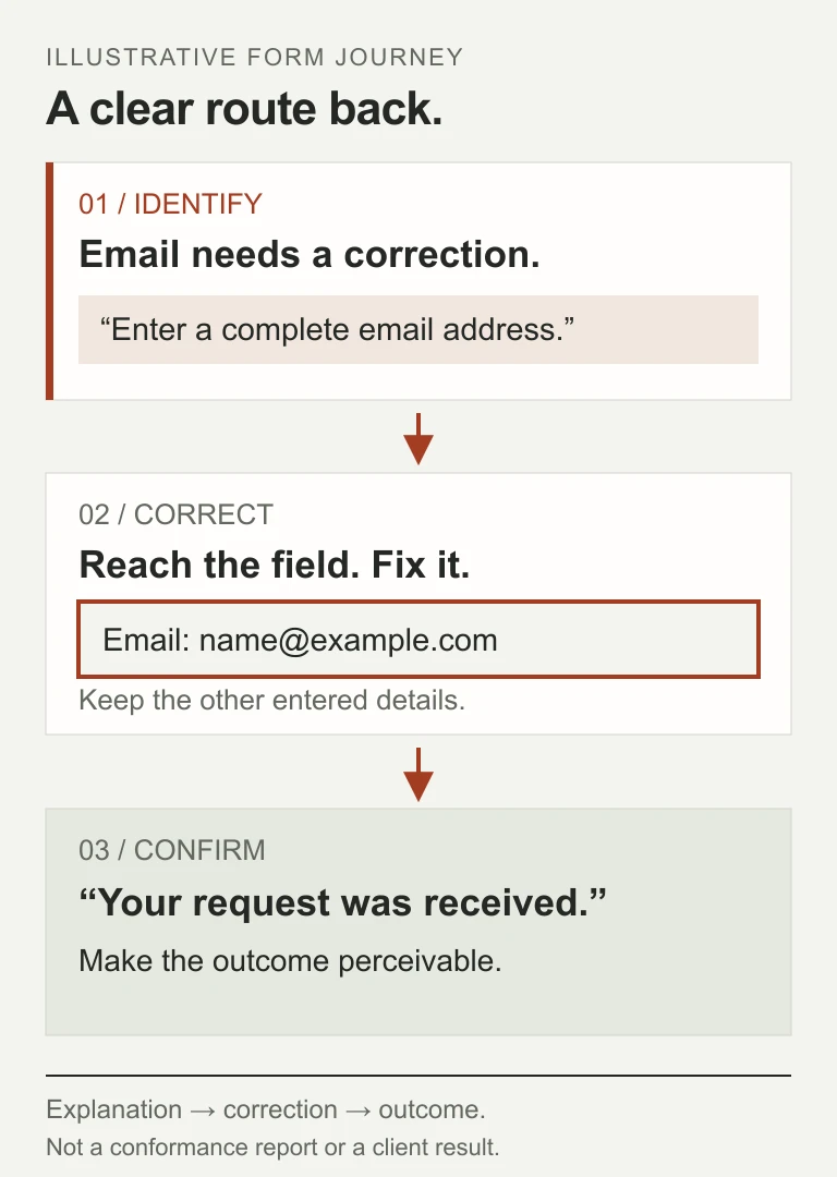
WAI’s form-notification guidance calls for understandable errors, clear correction instructions and feedback about success. Its techniques help explain why a validation badge is not the entire interaction.
Ask to see an omitted required value, a format error and an agreed service-failure state in a safe test environment. Can the visitor identify the affected control and continue without re-entering unrelated information? Is the outcome communicated to the evaluated assistive technology, rather than displayed only in a visual toast?
Keep accessibility feedback truthful. If the server has not accepted the request, do not label it received simply because a button was pressed. The business should define the success state; the design and implementation should make that state perceivable. Use test destinations for demonstrations, not fake enquiries sent into the live sales pipeline.
05 / 08
Premium design and accessible interaction are not opposing choices
A restrained visual system can still have distinctive typography, rich imagery and useful motion. The design question is whether those choices support reading and interaction under the agreed conditions. A heading that fits a static artboard may behave differently when text grows, content changes or the viewport narrows.
Review shared components early: navigation, buttons, inputs, dialogs and notification patterns. A correction in a common component can remove repeated barriers; a custom control repeated across the site can spread them. Choose native, well-understood interaction patterns when they meet the product need, rather than requiring novelty in every control.
Pay attention to sticky layers. W3C’s explanation of Focus Not Obscured (Minimum) discusses focused components hidden by author-created content such as banners or sticky headers. The AA criterion is about a component not being entirely hidden; it is not an assertion that partial overlap is ideal. For a clear experience, aim to keep the active interaction easy to see and follow.
Images need an editorial decision too. Some carry information that must be available in an alternative; others are decorative. A diagram containing the only explanation of a process leaves readers who cannot see it without that explanation. Keep the important relationship in the article or an appropriate text alternative, not just inside tiny labels in an image.
06 / 08
Buy an evaluation record, not a perfect-looking score
Automated checks are useful for repeatable findings and regression detection. They are not the whole review. WAI’s evaluation overview says no tool alone can determine whether a site meets accessibility standards and calls for knowledgeable human evaluation. A zero-issue report from a tool should retain that tool’s actual coverage and limitations.
Ask who performs the manual evaluation, what expertise is involved and which environments and journeys are covered. Record automated tools separately from expert review and user research. Do not describe an AI-generated checklist or a developer’s quick walkthrough as independent specialist assessment unless that assessment really happened.
WCAG-EM provides a structured way to scope, sample, evaluate and report. A supplier using that approach should be able to explain the chosen sample and its relation to the website’s variety and processes. A buyer demonstration of one form is useful, but it is not a complete conformance evaluation.
WAI also recommends involving users with disabilities to understand real experience. Their feedback complements standards evaluation. Include the relevant people respectfully, provide suitable access and support, and describe the limits of a small study rather than treating one participant as representative of everyone.
The report should make a finding reproducible: affected page or component, state, observed barrier, relevant criterion, environment, practical impact and proposed correction. After remediation, retain the verification result and open issues. A score can help track one tool’s observations; it cannot replace that record.
07 / 08
Include the booking widget, the document and the next editor
The journey may leave your own front end. Embedded booking, payment, authentication, consent and support tools can introduce barriers your main-site developer cannot repair directly. List them before selecting vendors. Ask for relevant evidence and evaluate the actual included path, rather than assume a vendor’s general accessibility statement covers your configuration.
If an essential component fails the agreed requirements, establish a correction path with its owner, evaluate a replacement or reconsider the interaction. An accessible contact alternative may be valuable support, but it does not automatically establish conformance of the original process. Say what has and has not been achieved.
Content continues changing after launch. Editors need practical guidance for headings, descriptive links, image alternatives, captions and accessible documents where included. A downloadable file is a separate content asset to evaluate; putting its link on an accessible page does not establish the file’s usability.
The CMS buying guide helps assess the editorial workflow. For accessibility, ask which defaults and constraints support editors, what still needs judgment and who checks new material. A CMS cannot invent a useful image description or approve the meaning of a chart on behalf of the business.
08 / 08
Turn the promise into scope, remediation and ongoing ownership
Ask proposals to separate accessible design and implementation, content preparation, evaluation, remediation and handover. Identify which work your team supplies and which specialist review is included. Compare that scope alongside the website investment, not as an unspecified compliance add-on.
Define the record you expect at acceptance: evaluated version and scope, target, methods, representative journeys, findings, corrections, unresolved barriers and limitations. Agree who makes the release decision and who maintains the standard as content and components change. Contract wording and legal assurances need appropriate professional review; this guide does not certify a site.
Axiom Forge recommends resolving high-impact interaction choices in discovery, then checking the implemented journey before the launch decision. That keeps accessibility connected to actual product work rather than a late badge on a proposal.
For a private discussion with our website development team, send the site’s audience, important journeys, languages, third-party steps and any known accessibility requirements. Use the project brief or hello@axiomforge.am. Share public links or sanitised examples—not passwords, private customer records or confidential documents. We can discuss a reviewable scope and the evaluation expertise it needs.
Sources and editorial scope
This is Axiom Forge’s procurement and product-delivery guidance, not a guaranteed project plan. The example is illustrative. Sources checked on 11 Oct 2026.
- W3C — WCAG 2.2 conformance requirements — Standards target, full pages and complete processes; not a universal legal duty or a certification of this site.
- WAI — Evaluating web accessibility — Automated tools complement knowledgeable evaluation; a tool alone cannot establish accessibility.
- WAI — Form user notification — Error, correction and success feedback form a usable interaction.
- W3C — Focus Not Obscured (Minimum) — Correct scope of the AA criterion and effects of author-created overlapping content.
- WAI — WCAG-EM overview — Scope, representative sampling, evaluation and reporting; a methodology, not automatic certification.
- WAI — Involving users in evaluation — Real experience with disability complements standards evaluation; avoid universal conclusions from a small sample.